Building a voice & tone system out of thin air
Klarna had a distinct personality everyone could feel and nobody had written down. I led the content design team that fixed that — and turned it into the reference every non-writer at the company now reaches for.
The situation
By the time I picked this up, Klarna already had a voice — you could feel it in the app, hear it in the way people on the team talked about the brand. What it didn't have was a documented one. We were a small team of content designers supporting well over a hundred product teams, which meant most UX copy in the company was never going to touch our hands. If we wanted consistency at that scale, we needed to make good judgement teachable, not just practise it ourselves.
So I led a group of content designers to define and document Klarna's voice and tone, with three goals: give every team — writers or not — a resource they could use without us in the room, align our in-product voice with the brand's, and teach the wider org what voice and tone actually are, and why they matter to the experience.
Who does Klarna sound like?
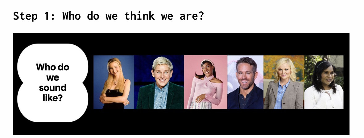
Anyone in content design knows the glazed look you get from non-writers the moment you start explaining the difference between voice and tone. So instead of lecturing, we turned it into a game people wanted to play. We asked people across product and design one question: if Klarna were a person, who would they sound like?
That single question did more work than any slide deck. It let us explain voice as someone's personality — constant, unchanging — and tone as their mood in the moment: think Ellen on her talk show versus Ellen backstage. We collected copy from every corner of the business, from social posts to in-app confirmation screens, and used it to ground the exercise in things people actually recognised.
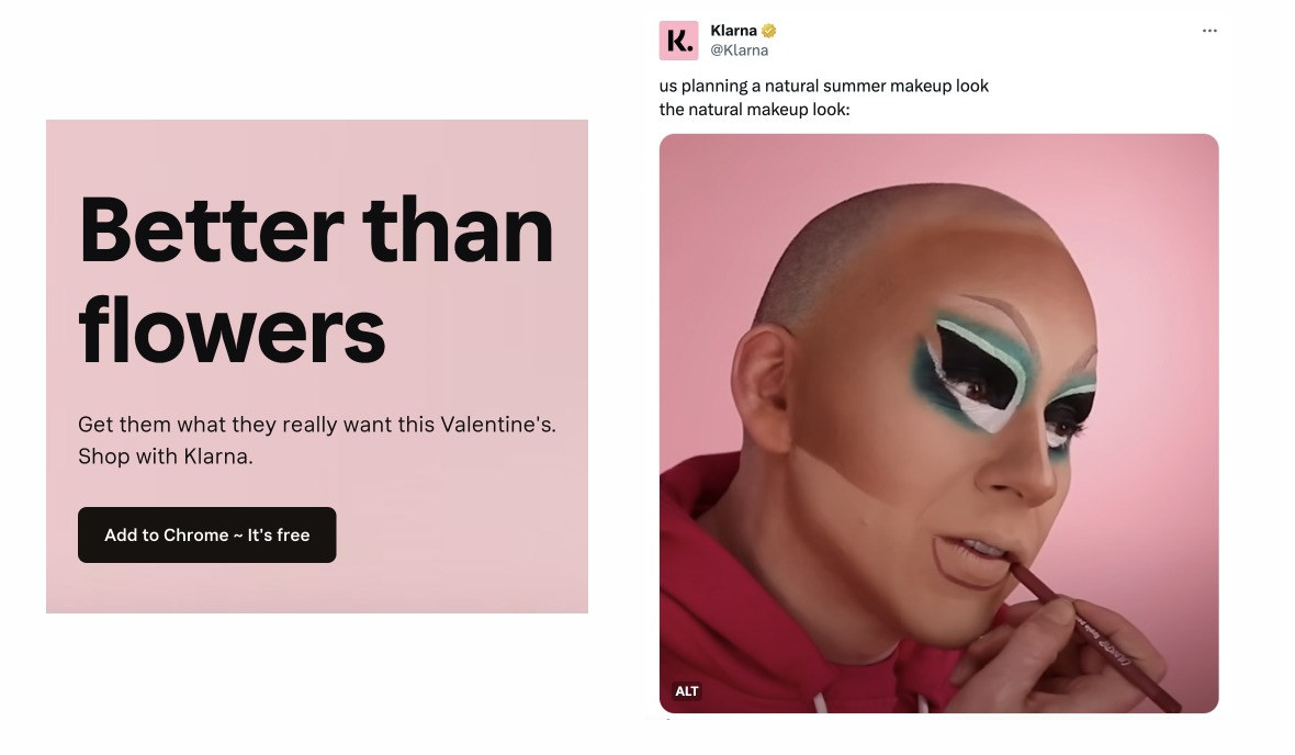
We keep it real
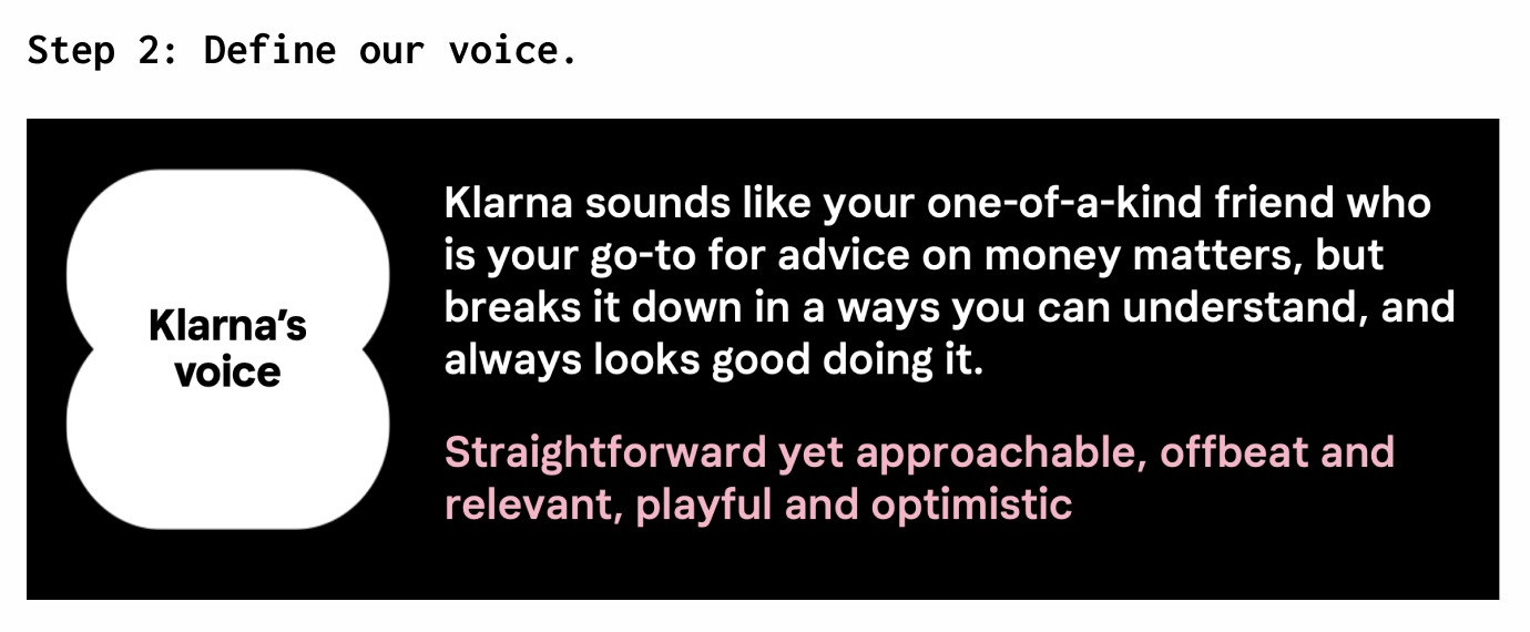
From that exercise, the content design team workshopped an actual definition of Klarna's voice — starting with adjectives, then drafting a bio. The description that survived had to carry three things: straightforward, a little quirky, approachable. When brand refreshed their own marketing voice description shortly after, the overlap with ours was obvious — clear synergy between the two teams' independent work.
(Ironically, "synergy" isn't a very Klarna word.)
Building the tone spectrum
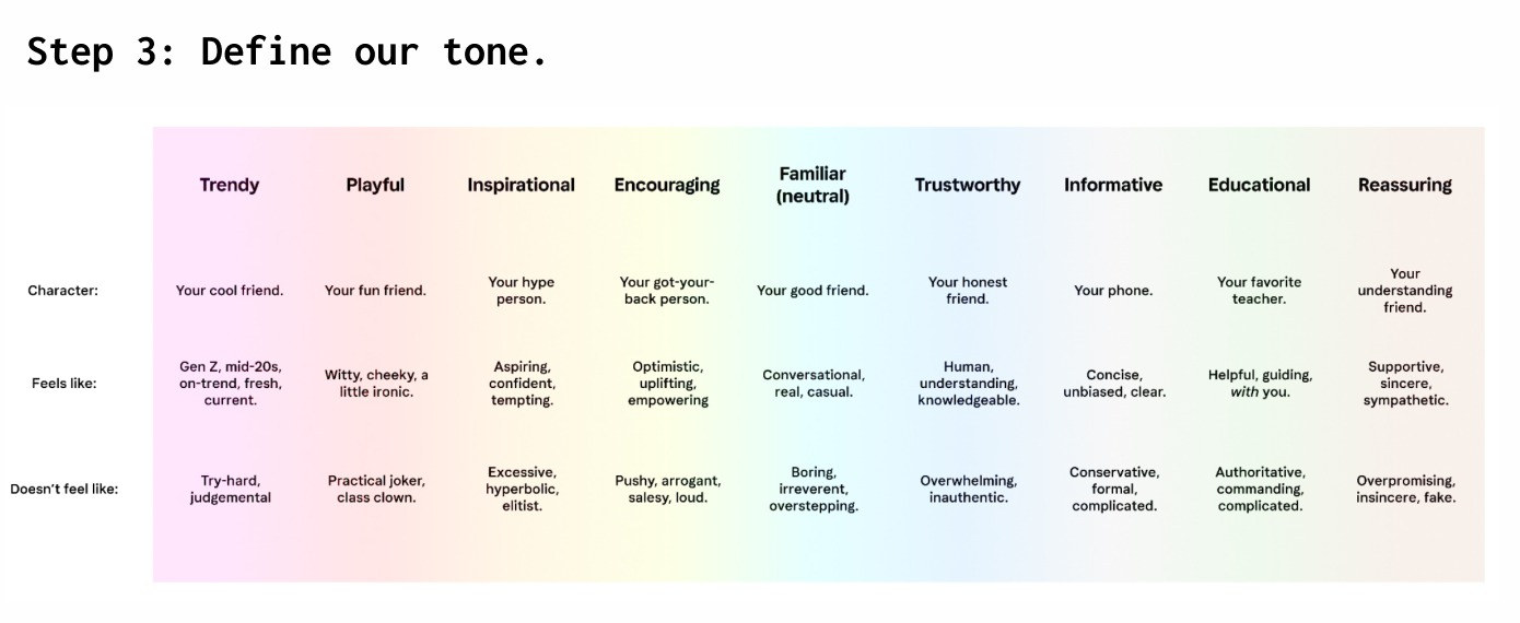
With the voice fixed, tone was the harder problem — tone shifts by context, and "be more playful sometimes" isn't a usable instruction. We looked at how companies like Intuit and Meta documented tone, then built a spectrum running from trendy and playful at one end to educational and reassuring at the other, mapped incrementally against our own corpus of real content.
To make it usable by non-writers, every point on the spectrum got a character: "inspirational" became "your hype person," "educational" became "your favourite teacher." We backed each one with a bank of rewritten example phrases, so a PM could look at a tone label and immediately see what it sounded like in practice.
Principles the system runs on
Five rules that made the difference between a document people cite and a document people ignore.
Voice is personality. Tone is mood. Teach the difference with people, not definitions.
Nobody outside content design retains the textbook distinction. Everybody instantly understands it when you frame it as a person: the same individual on stage versus backstage. Asking "if Klarna were a person, who would they sound like?" did more work than any slide I could have written.
Give every point on the spectrum a character, not a label
"Educational" is an adjective, and adjectives are where alignment goes to die. A character is something a PM can picture and check their draft against without a writer in the room.
Never ship a tone label without example copy attached
Every point on the spectrum came with a bank of rewritten phrases from our own product, so a label was never an abstraction. Show a non-writer the same message written at three points on the scale and they understand tone in about eight seconds — faster than any explanation, and they retain it.
We also gave every tone a "doesn't feel like", which turned out to matter as much as the positive definition. Told to be playful, people overshoot into practical joker. Told to be encouraging, they overshoot into pushy and salesy. Naming the failure mode is what keeps a spectrum usable by someone who isn't a writer.
Ground it in copy people already recognise
We collected real content from every corner of the business — social posts, in-app confirmations, everything — rather than writing idealised examples. A guideline built from invented copy describes a company that doesn't exist. Built from real copy, it describes yours, and people can see themselves in it.
You'll know it's working when people stop using their own words
The success measure for a voice and tone system isn't adoption metrics. It's overhearing a designer say "this reads more hype-person than favourite-teacher" instead of "can we make it punchier." When the vocabulary spreads without being taught, the system is doing its job — and it's what let the spectrum outgrow its brief into markets, marketing email, and eventually icon and illustration choices.
What changed
Designers and PMs started giving feedback in our language instead of their own — "this reads more hype-person than favourite-teacher" instead of "can we make it punchier." That's the real marker of a style guide working: people start using its vocabulary without being told to.
The spectrum outgrew its original brief too. It's since been adapted for specific markets and for marketing email, and I built a version of it to guide icon and illustration choices as part of adding content design to Klarna's design system — now in use for a project rebranding the company's product imagery.